Overload

This is my final image of all of my T-Shirt designs I have created for Overload (street info). I created 4/5 designs, whether or not you want to count the last two designs as separate designs. I kept them separate because it makes sense to have "The Company", but I do like how clean it looks when the shapes are left alone. I have also made multiple colors for each design so you can see what it would look like on different shirts. Having variations is always nice. Below I have included a description for each design and included a more close up picture of each shirt. I chose to show my favorite color for each shirt down below.
Line 1

|
This was the first design I created. I wanted to create a compiled text design, and I had about 3 or 4 different versions, but I finally settled on this one and made it in Illustrator. I did have trouble because the need to block off black lines with white bars, so I was forced to rasterize so now the design is not full quality. I was thinking about putting colors on it because it resembles the shape of a skateboard, but I felt like it would be hard to see, and it would feel like too much was happening.
|
Line 2
|
This is my second design that I created and this one is actually my favorite. I have done this thing in my past where I take text and compile it and overlap it (my own logo/watermark). I noticed that Overload has some more old-school looking styles, which is why I decided to implement this color with this design and shirt. I think it looks really nice. I put a subtle shadow behind the design which makes it look imprinted. I had the most fun making this design because of the new techniques I used for the curving text, and in the past I created the text overlapping in Photoshop, so that was a nice change using Illustrator.
|

|
Line 3

|
My third design was my first idea that I drew on paper. I wanted a very similar design, but I feel like this is not my strongest design. I did add the corner pieces to give it some energy, but the text is hard to read in such a small photo. This design is more about the different style, and less about the perfect text.
|
Line 4
|
I created this design in many different ways, so I did end up choosing two versions (below). I had the idea of a more abstract design by using shapes to create text that looks like "OVRLD". I like the simplicity because the squares represent different letters, but it just looks super clean. And the "L" is backwards, but that flows well with the lower case "r" that faces the opposite way. I then added "The" and "Company" just to be more clear on what these shapes are, but it does take away from the cleanliness of the design which is why I have the similar design below.
|

|
Line 5

|
This designs is pretty much identical to the one above, but I decided to remove the text "The" and "Company" to give it a more simplistic feel, and something that anyone can wear. I really like this design because of the way I put it together and how simple it is.
|
CCA
|
This is my first CCA T-Shirt design. I like this design the best because it is simple, has some rugged text that just flows with the feathers on the raven that sits on top of the corner of the A. You can either interpret it as the raven is landing, or it just taking off. The design shows everything it needs to and gets to the point.
|

|

|
I also like my second design because it is the simple design I had above. But it isn't as creative as my OVRLD design and it doesn't look as clean because there aren't as many similar letters. It looks nice, but I am not sure it is the perfect fit for CCA.
|
|
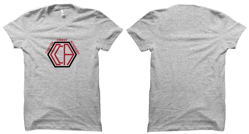
This is my third and final CCA design, which is just a simple text and shape design. I like the flow of the CCA letters inside hexagon, and I used new techniques to get the text around the outside of the shape. I like this design, but I do like my Overload designs a bit more.
|
|
